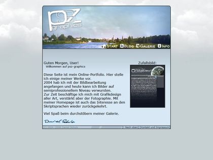
This website first went online in 2004 as 'psz-graphics.net'. It's been through a lot, especially in its infancy. Let's go back there from today and see how weird it gets...
2020
This is the current version of this website. It's a Hugo-based static HTML/CSS site, with a little Javascript sprinkled on top.
It's also the version that I first started blogging on tech topics on.
2016
I started leaning into web development heavily in 2016 when I began working at an e-commerce agency full-time. Before that, I was a lot more focused on visual art. I was showcasing some photos and 3D renderings on my website. After not updating that for years I finally decided to take that offline altogether.
The design has some obvious clues to the current version: No header and the boxy floating menu.
Under the hood, it was a completely different thing though. Instead of Hugo, this was powered by WordPress and instead of using some light javascript where it's needed, it used jQuery to even display its content. The listing was an endless scroller that fetched articles from Wordpress's REST API as you went down. It took ages to load and ages again to lazy load content. Around that time I first got in touch with performance-focused code. Over time, I stripped out jQuery, optimized the page load waterfall for the First Contentful Paint.
2011
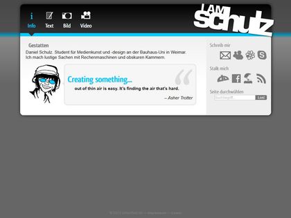
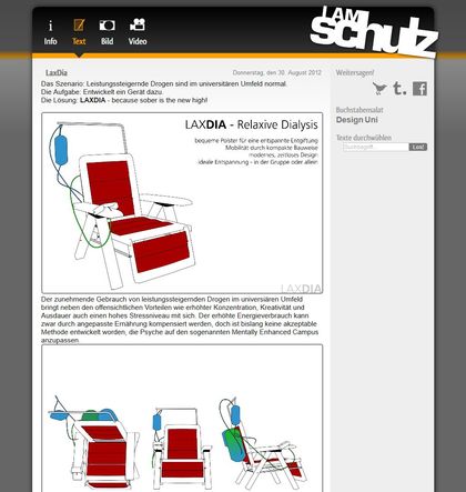
This version was online during the time I studied media art and design for the purpose of documenting my work. This version begins showing the marks of time: Contact options include MSN Messenger, ICQ, and Skype and there's a prominent RSS icon (I miss those).
I do still like the design, even today. It's structured, mostly monochrome, and has color-coded hints on what part of the page you're on. What it's not, is responsive. The mobile web was still in its infancy in 2011. Even the term itself was just coined in that year.
The tech stack is a wild ride: The site was powered by some self written PHP scripts that gave me an admin area with an entire CMS (with BBCode!) and media management tool. You could smell the code a mile against the wind. This is how the content was loaded into the page:
<?php
// URL auf Include-Parameter überprüfen
if(isset($_GET['action']) && !empty($_GET['action']))
{
    $action = addslashes($_GET['action']);
    $include = "includes/".$action.".inc.php"; // .inc.php als Dateiendung für includes festlegen
    if(!file_exists($include) || strpos($include, "http") !== FALSE || strpos($include, "../") !== FALSE)
    {
        $include = "includes/fehler.inc.php";  //Fehlerseite bei falschen Parametern festlegen
    }
}
else
{
    $include = "includes/index.inc.php";  //Startinclude festlegen
}
include($include);  //Datei einbinden
?>
Holy cow! Migrating to WordPress sure was a step up.
2008
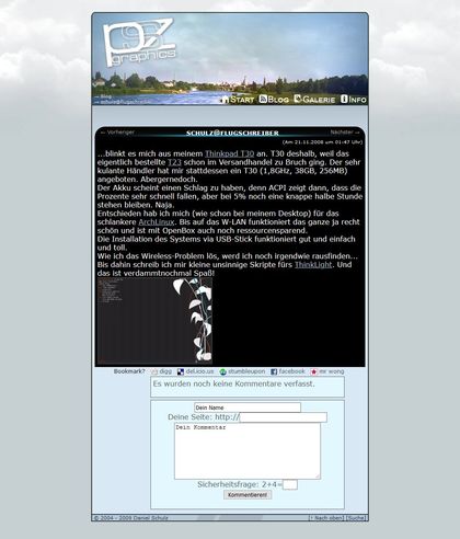
The predecessor is a bit simpler. It too uses an include mechanic similar to the above, but each include is just a hand-coded HTML file. It's basically Server Side Includes, but PHP based.
The design seems reasonable for the time, at least until you navigate to a blog entry. I guess I thought those out-of-place inverted containers looked cool back then. However, it only goes downhill from here...
2006
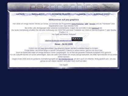
Who gave that teenager a Photoshop license? It's swirly swooshes everywhere! I remember being a big fan of the plastic-glass style font effect in the header and even writing a tutorial on that.
The decorated border would be a challenge for today's web technologies and was straight-up impossible in 2006. My solution was to just cap the layout at 1024*768px (which coincidentally was my monitor resolution back then) and have a scrolling container inside. It was the first time writing a website with CSS for me, so doing that felt like magic.
Also, the entire site is nothing but HTML and CSS. I just had to open the files in a browser to see the project as I left it. Nowadays, when dealing with node setups, docker containers, and local servers everywhere, that feels like magic, too.
2004
Let's head into Cringe Zone full-on, shall we?
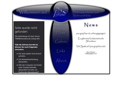
Those were my very first steps in hand-written HTML. Everyone taught me how to do tables, so that's what I did. That's basically all I did. This webpage did not have any text, everything is an image - and with good reason: I could use Papyrus as a font. Papyrus! Even as copytext! What was I thinking!
Of course, this abomination was designed in 1024*768px as well. It sticks to the top-left corner when the browser gets any larger than that. Nevermind the design. Apparently, I did not have any sense of style back then. What I did have, was a shoutbox. Those were a thing back then. It was a small form-factor guestbook type of thing, and because I couldn't write that myself, I included a third-party one as an iframe. I can't reconstruct that anymore, because the service has since gone offline, so all you get is a failed iframe here.
To sum up all the glory:
- Dark blue glossy style
- Header says "Welcome"
- Centered Navigation is titled "Navigation"
- HTML table layout, no CSS
- Design is an image
- Text is an image!
- Vivaldi and Papyrus.
It was a pure 90's webpage, just 5 years late.
(Header image by jmortonphoto.com and otogodfrey.com as CC BY-SA 4.0)